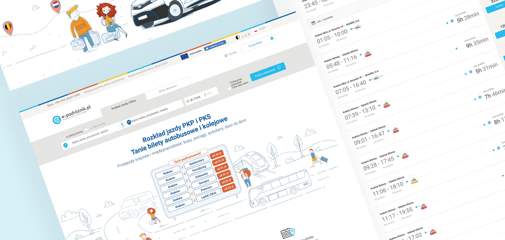
Stage 1: In tandem with whom?
Teroplan – the largest search engine for public transport
Teroplan S.A. is the creator of websites that offer possibilities for searching, booking and purchasing tickets for public, intercity and international transport. Our main goal was to increase the usability and accelerate the development of the e-podróżnik portal, as well as other Teroplan products.

Multiple carriers in one place
Teroplan offers access to the timetables of over 1,000 different carriers, including buses, trains, coaches, minibuses and other forms of public transport.

Planning any trip
The Teroplan search engines allow you to plan a direct trip, or a journey in which transfer options can be considered by combining intercity and international services with local transport schedules.

Business without borders
Teroplan works in many European countries, including Poland, the Czech Republic, Serbia, Slovakia, Germany and Ukraine.
Cards on the table
Let’s start with the specifics
The effects of our cooperation with Teroplan were:
15 %
increase in conversions from searching for tickets on the e-podróżnik website
12
other projects completed together
100 %
of goals achieved
Stage 2: Where to?
Design challenge
In 2013, when we started our cooperation with Teroplan, the e-podróżnik – the company’s key product – was considered to be technologically advanced, but its UX/UI layers were far from the market standards.
We knew that cosmetic adjustments would not be enough in this case. To increase the user retention and conversions – travel planning and ticket purchases – a complete redesign of the website was necessary.
An additional task that we needed to deal with was the creation of a new visual identity (along with a logo) for Teroplan’s products. The aim of this task was to improve the aesthetics and increase the visual attractiveness of both the desktop and mobile versions of the website.
Stage 3: In motion
Process
What changes should be made to a product to achieve your goals? The answer to this question is not always obvious – especially when dealing with a complex website with many user paths, such as e-podróżnik.
To recognise the needs and expectations of the Teroplan users, our team had to fully understand numerous issues related to public transport and the search engines designed for transport connections. We conducted in-depth research with the users of competing platforms and then created UX mock-ups.
Thanks to the dedicated research methodology that we created for Teroplan, we were able to analyse the usability of the proposed solutions on an ongoing basis. We then carefully tracked changes in the user behaviour after subsequent implementations and introduced further refinements based on those changes.
Implementation details
Our cooperation with Teroplan included elements such as:
- Internet analytics
- UX audit
- User research
- Maintenance of websites
- Functional design
- Graphic design
- Constant cooperation
- Technical assistance
Stage 4: Finish
Solution
Based on the functional designs we prepared, we introduced several improvements. The first of our solutions included changes to the transaction process, customer account and the connection search process for the selected destination. Thanks to these improvements, we reduced the time needed to order a ticket. We also managed to minimise the risk of user errors.
In addition, we created visual identification proposals and tested them on e-podróżnik users. Based on the version that was best received, we redesigned the entire website.
By analysing the data we collected on user behaviour, we introduced further product improvements. The effect was an increased rate of conversions from searching for tickets of 15%.
Implementation
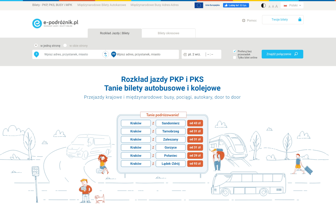
Home
Drawings were an important element of the new visual identity. Thanks to them, the website became more emotionally engaging and the user retention increased.
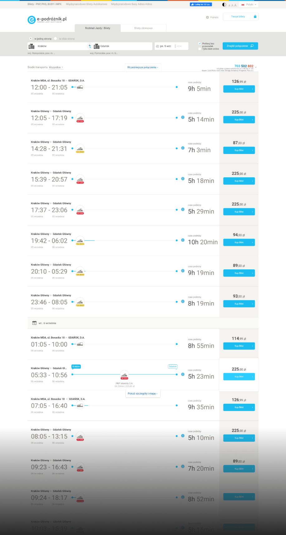
Search Results
The new way of presenting the search results increased the conversions to ticket purchases and made it easier for the users to compare connections.
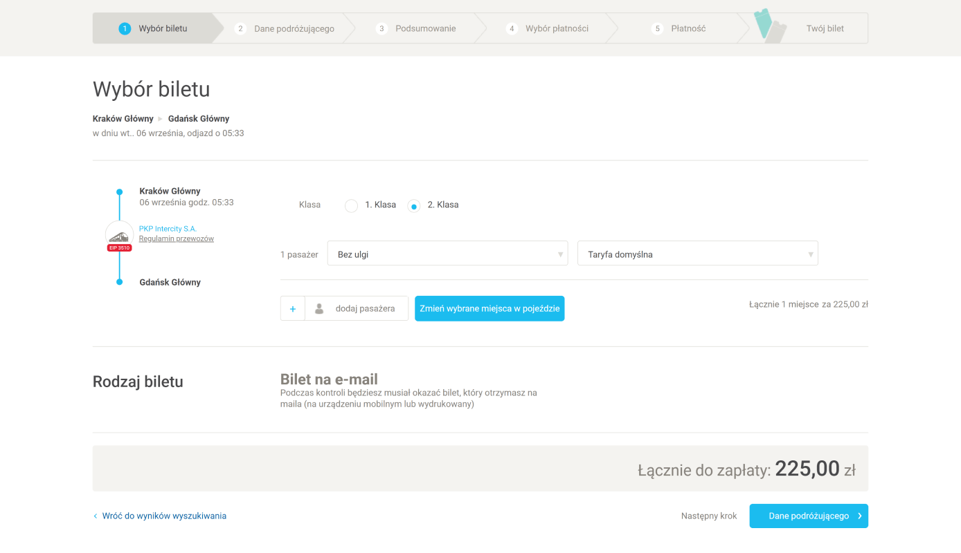
Transaction Process
Simplifying the transaction process made the purchase time shorter, while users make mistakes less frequently and finalise the transaction more often.
It’s not over yet
Many years of cooperation
Tandemite and Teroplan have now been partners for many years. For almost a decade, we have been creating and implementing projects for the carriers who are working with Teroplan. In addition, we have designed visual identification and programming solutions for new Teroplan brands from scratch.
SuperPKS
Users really liked the visual identification and services of the new carrier that we designed, which is clear and user-friendly.
Hoper
Our team created the visual identification and designed the website for an innovative transport service. In other words, we went from zero to an entirely new brand.
Arriva
A thorough refreshment of the Arriva carrier’s website allowed us to improve its functionalities.
Voyager
The website responds to the needs of mobile users and people who are making travel plans via the Internet.
Tech stack
Technologies we used
During the implementation of the system for Teroplan, we focused on solid solutions and technologies that we had tested many times before. Here are a few of them:
Symfony
Framework and a set of PHP components that allow you to implement web projects within a short time.
SHARED SUCCESS STORIES
