Stage 1: In tandem with whom?
Taxpress – an opinion maker in its industry
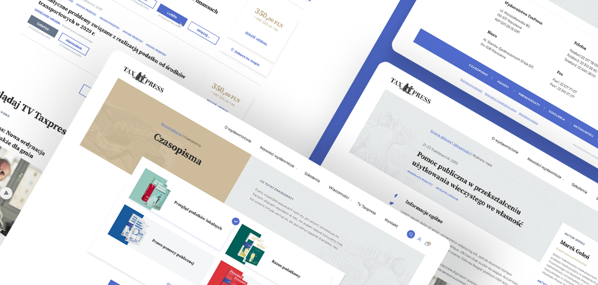
Taxpress is a company with over 20 years of experience, offering its clients courses, books and specialist publications. It deals with issues related to the fields of tax law, public finance and state aid. Our goal was to create a sales system for such a diverse range of offerings.

Magazines
Taxpress is the publisher of four monthly magazines, which are available for traditional sales and via subscriptions

Books
The publishing house regularly publishes studies related to legal and tax issues.

Courses
The company organises courses – initially only in-person, but now also online.
STAGE 2: WHERE TO?
Design challenge
Taxpress had a specific problem – the system that had been designed by a competing company did not work. After two years, the client decided to end this ineffective cooperation and start from the beginning with Tandemite. What was our advantage? We had experience in e-commerce design for the training industry that we gained while working on the Socjomania website.
The implementation of Taxpress was associated with three basic challenges.
First, we had to design a system that would enable sales of three entirely different types of products: books and magazines, periodical subscriptions and training courses. It was therefore necessary to create a unique structure, as well as to make it easier for the company to manage its diverse assortment.
Secondly, we faced the challenge of designing a modern system that would remain based on a traditional, conservative identity, which was firmly rooted in the minds of the recipients.
Finally, the Taxpress website had to be adapted to SEO requirements and leave space for an extensive content layer (detailed product descriptions), which would help with building an appropriate image of the company.
Stage 3: In motion
Process
Our cooperation with Taxpress started with a UX audit, which we conducted to check how users go through the website and how they react to the complex range of offerings. In this way, we were able to spot the most important problems with the system and understand the users’ expectations.
Together with the client, we decided to create a new portal (named Kazus Podatkowy), designed to both sell products and communicate with customers. After this, our client also decided to let us take care of their other portal. We implemented it on the same platform as the Tax Case.
To design both services based on our customer’s expectations, we decided to use an existing brand image. We used elements from Taxpress and Kazus Podatkowy, which were deeply rooted in the users’ minds, and implemented them in a new way.
Implementation details
In cooperation with Taxpress, we used tools such as:
- Business analysis
- UX audit
- Pimcore
- Functional design
- Graphic design
- Software and implementation
Stage 4: Finish
Solution
Our team designed two consecutive online stores that were fully tailored to the client’s needs – first for the Kazus Podatkowy website, and then for the Taxpress website. Using Pimcore was significant in the implementation processes of both stores – thanks to the platform, our client was able to use the PIM mechanisms to manage their offers.
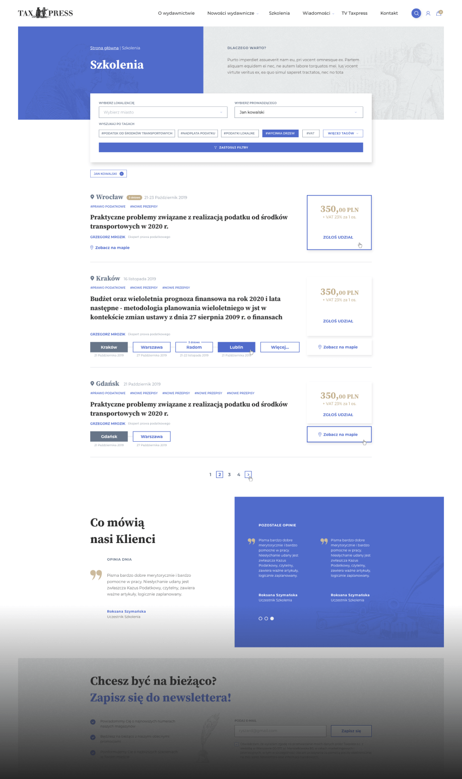
We also took care of the option for posting extensive product descriptions, thanks to which the users fully understand what they are paying for and what knowledge they will obtain. We optimised the tools for searching and filtering the products and content for individual groups of recipients. Furthermore, we added the ability to download an electronic version of the purchased materials from the user’s account, thanks to which the website gained the dimension of a personal virtual library.
With regard to the courses, we used a system of tags and dependencies between individual products. Thanks to this, we made it easier to present various variations, such as dates, price packages, agendas and course leaders. The administrator also gained the ability to combine products from the range with selected articles from the knowledge base, in order to present them to users who are interested in a specific issue.
The system we created, which was used to sell classroom training, turned out to be flexible enough to start selling online training courses during the COVID-19 pandemic.
Implementation
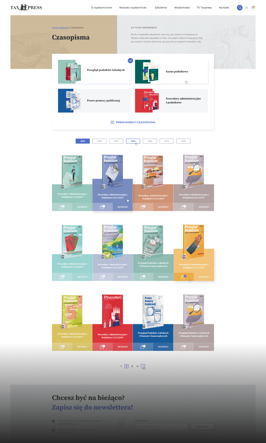
Breakdown of the content and products
A clear layout of the content and products makes it easier for a user to quickly reach the selected category. Cross-selling solutions also increase the sales efficiency.
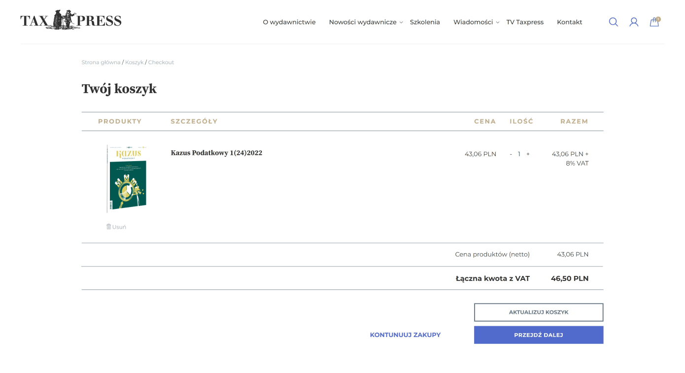
Simplified shopping path
Regardless of the product category, the path from a decision to a purchase is short and simple. Thanks to this, the user can go straight to their goal.
Planning and purchasing training
Clearly presented training information helps a user to select, pay for the appropriate training course and schedule it in their calendar.
Tech stack
Technologies we used
In our projects, we only use proven technologies. For Taxpress we used:
SHARED SUCCESS STORIES

