So, you want a Shopware shop. Good choice! It is an innovative and flexible e-commerce tool, with a wide range of modern design possibilities. The platform allows creators to design interesting visual effects and use its extensive range of functionalities, without worrying about system-to-system integration or structural integrity. The many examples of Shopware applied in practice provide a veritable cache of inspiration and knowledge that is sure to provide valuable insights into the effective development of an online store.
From this article, you’ll learn
- How to create a Shopware website.
- Which stores are a good source of inspiration?
- What the modern user experience entails.
- Whether the choice of a platform matters.
- How to start creating a functional design,
- Why is accessibility essential?
Shopware store designs - how to do this right
Innovation is an essential aspect of every modern e-commerce tool. Innovation allows designers and programmers to translate their artistic visions and imagination into actual projects that appear on real devices.
Among the many popular e-commerce platforms available on the market, Shopware truly stands out in terms of its flexibility. This flexibility is precisely what allows the designers of online stores to easily make entirely new layouts and implement creative solutions, which are both visually attractive and convenient for customers to use.
In a world of dynamically progressing technology, offering high-quality products or services is not enough. To be successful, a business must also provide an excellent user experience, by optimizing the path to purchase. When it comes to shopping experiences, it's important to create great shop layouts.
How to create a store with Shopware
Shopware offers three different subscription plans: the basic plan costs EUR 600 monthly; while the other two plans have non-standard pricing and provide extended functionalities.
Once you have decided on one of the three subscription plans, you can start planning out the appearance and configuration of your store. Shopware’s experts are ready to provide support and answer questions, at any stage of the implementation.
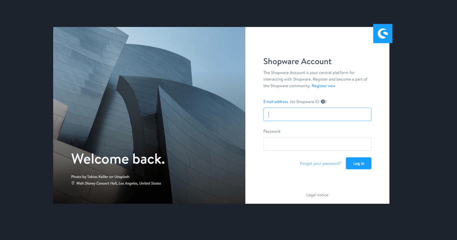
The first step after choosing a subscription plan is to register with a Shopware account, which will serve as your Shopware administration panel:

Once you have registered, you are free to use your account in order to:
- Manage your subscription plan
- Configure your store
- Install additional plugins and functions.
You can adjust the visuals in your store using Shopware’s pre-made templates, or introduce your own creative vision.
After you create and configure the Shopware templates for your website and customize its visuals, you should take the time to familiarize yourself with the instruction manual provided by Shopware. Shopware’s developers have paid close attention to making it easy for their users to find all the information they need to manage their online store.
If you are unsure whether to opt for Shopware, you can try out the demo version, which will let you test the platform along with all its functionalities before you purchase.
Shopware in practice
Amazing things will happen when you listen to the consumer - Jonathan Mildenhall
Shopware is used by a variety of vendors throughout the world every day, who appreciate the rich selection of functionalities offered by this Germany-based software that results in real benefits.
Below, you’ll find a few examples of the powerful possibilities delivered by Shopware:
Coffee Circle

A well-designed coffee shop is a dream come true for everyone who enjoys caffeine. Coffee Circle is not just a business, but a brand that donates part of its revenue to provide education, drinking water, and coffee farming in developing countries.
Coffee Circle’s website has been designed to be user-friendly from the very first steps. There is a search bar in the top-left corner and navigation tabs on the right. The shopping cart, menu, and crucial contact information are all easy to find and legible.
The green colour scheme is reminiscent of the world’s most popular coffee shop in the world, whose name everyone should be familiar with. This association lets visitors know immediately what kind of store they are browsing.
Armedangels

Visitors to Armedangels’ website are greeted with a modern graphical design, composed of geometric shapes that form an arrangement of rectangles of different sizes.
Another striking feature of the website is its unusual typography that leads naturally to a page about the brand owners’ mission. According to the website, they started caring for ecology and sustainable development, even before it became fashionable.
The website has a very clear interface. The cart and search bar are located to the right and the categories are to the left. Shoppers can view the contents of their cart or change pages at any point.
Douglas

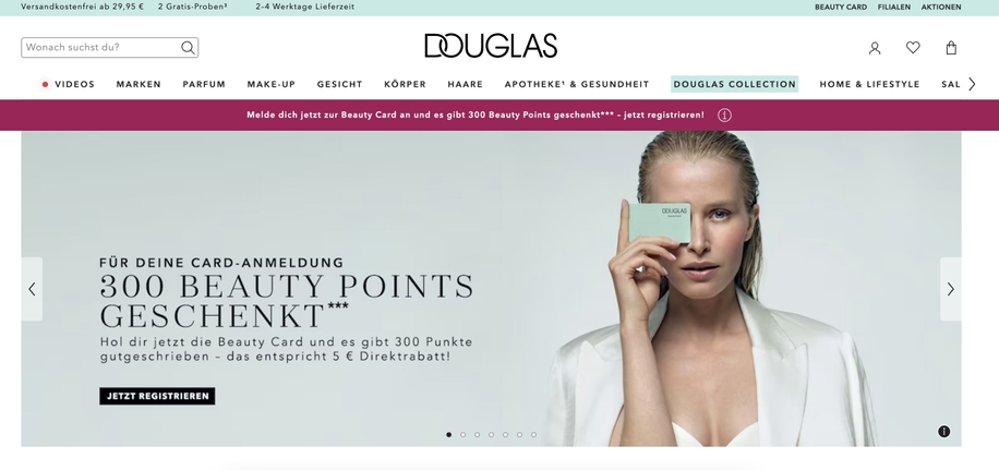
It may come as a surprise, but the well-known Douglas perfume store owes its convenient path to purchase and its attractive visuals to Shopware.
Of course, the interface contains the basic elements, such as a cart, categories, and a search bar. The design is very minimalistic and is complemented by the pastel colour scheme in the product photo backgrounds.
The website stands out with its product subpages, which contain not only aesthetic photos, but also a selection of important parameters. As a result, reaching essential information, such as the price or product variants, is as easy as it gets.
To summarise, the stores of the aforementioned small and large brands are excellent demonstrations of the possibilities offered by Shopware. The fact that even though all the brands operate on the same platform, their websites are still visibly different, shows that their developers have obtained the freedom they need to be creative.
Modern user experience
There’s nothing more effective in the e-commerce industry than tailoring your business activity directly to the needs of your customers.
A top-notch user experience should be a priority for your online store. The entire shopping process is just as essential as the first impression.
Monitoring your customers’ experience will give you the data you need to optimize your path to purchase and the other functionalities of your store, as will user feedback and evaluation surveys.
Shopping worlds and experience worlds are the key concepts in Shopware. The former is related to the consumer experience, while the latter proves that it’s worthwhile to make a new layout to meet your users’ expectations.
It’s worth adding that the developers of Shopware endeavour to make all of their users happy, including programmers. That’s why Shopware Frontends was created: to boost the developer experience and allow for faster prototyping and creating non-standard websites.
An appropriate e-commerce platform
Success in the e-commerce industry depends on choosing a good platform that provides access to modern technologies and the quick implementation of changes.
Shopware users enjoy creative freedom, while its open-source infrastructure means that everyone can modify and share the platform’s source code.
Another undeniable advantage of Shopware is its security measures, as the developers of the platform know that protecting their customers’ data is essential.
Functional Shopware web design
A UX design does not end with the visual layer, even though this is undoubtedly one of the most important elements that users are exposed to from the very beginning.
Accessibility is an equally crucial consideration when you care about shopping experiences. The customers of your store may include people with disabilities, such as poor vision or colour blindness, who will see some of the visual components of your website completely differently from the majority of users. That’s why every website should have an option to adjust its features to the needs of different users.
Regine Gilbert makes a very convincing point about the inclusion of accessibility in a UX design:
Imagine if 90% of the websites or mobile apps you use today suddenly locked you out. Everyone else could continue to experience the convenience of mobile banking, the connectedness of social media, and the freedom of online and shopping experiences, but for you, they have become inaccessible. For the 57 million people with disabilities in the United States, this is their everyday experience.
Other critical factors in e-commerce, in addition to the storefront, are a well-designed path to purchase and easy complaint and return procedures. Such interactions should also be tailored to the users’ expectations based on prior research into their real needs, and be designed with inclusivity in mind.
The design process relies on user and competitor research and on creating prototypes, which should be tested before their implementation.
Shopware is a solution that supports a good UX and UI while allowing developers to create an attractive website template and a functional store that is adjusted to your customers’ real expectations.
Summary
Creating a store in Shopware or deciding for a completely new layout may appear challenging, but only if you don’t know the right way to proceed. With the steps presented in this article, you’ll have no trouble setting up a Shopware shop on your website.
A good design is not only about aesthetics – it’s also about a well-thought-out architecture of information, functional user paths, and positive experiences.
Shopware guarantees excellent website visuals, improved users' shopping experiences and a reliable, API-based system. The platform is also secure, to protect customer data.
Have you already decided that Shopware is just what you need? Or maybe you require some support in setting up your first online store?
Whatever stage of implementation you’re in right now, feel free to get in touch, and we’ll be glad to help you create an effective online business.


