Stage 1: In tandem with whom?
AXA Assistance – a leader in the insurance market
AXA Assistance is part of the AXA Group – one of the world’s largest and oldest financial services companies. AXA Assistance provides insurance and assistance services in the following areas: home, health, vehicles and travel. Our goal was to create a user-friendly and functional reporting system for online claims.

Assistance
Assistance is an insurance service in which, instead of the payment of compensation, the insured party is provided with adequate assistance, organised by specialist entities.

The competition is far behind
For 10 years, AXA has been a leader in the rankings of insurance companies prepared by Best Global Brands.

Business without borders
AXA Assistance operates on five continents, in almost every country throughout the world. We were focused on creating a system specifically for Central and Eastern Europe, i.e. the Czech Republic, Poland and Slovakia.

Stage 2: Where to?
Design challenge
For many years, AXA Assistance has only used an internal loss registration system. To report an incident, the insured person had to contact an AXA telephone consultant and provide him with the necessary information.
The process of registering claims with the help of the hotline and the internal system was problematic. In particular, it was ineffective, time-consuming and demanding for both for clients and the telephone consultants. Therefore, AXA Assistance decided to create an online system that would enable the insured party to report incidents independently. To achieve this goal, they organised a competition.
We won the tender and started our cooperation with the AXA teams – the Polish team, which was responsible for the back-end work; and the Czech team, which was responsible for business issues. The main challenge we faced was combining two elements: we needed to meet the complex, precise requirements of the insurer, while also granting a quick and efficient process for reporting claims to the insured party.
Stage 3: In motion
Process
Our cooperation with AXA Assistance began with a UX workshop that was organised in Ostrava. During the project meetings, we discussed issues related to the operation of the system, while identifying personas and the user needs.
We had written all the processes in the form of a service blueprint. sing the Object-Oriented UX methodology, which enabled an effective analysis of complex structures and information hierarchies, we then carried out the next stages of the design work.
The workshop resulted in the creation of two models for reporting damage. The first solution was based on classic insurance forms, in which the user carries out the next steps. The alternative version allowed a notification to be created with a minimum amount of data. It also made it possible for additional information and documents to be entered at any time. This was the type of interface that we decided to use in the AXA Assistance system.
Implementation details
Our cooperation with AXA Assistance included elements such as:
- Business analysis
- Functional design
- Graphic design
- UX Workshops
Stage 4: Finish
Solution
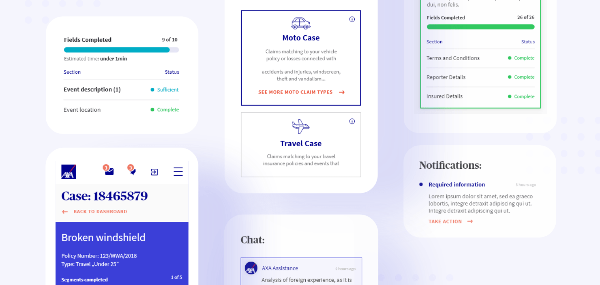
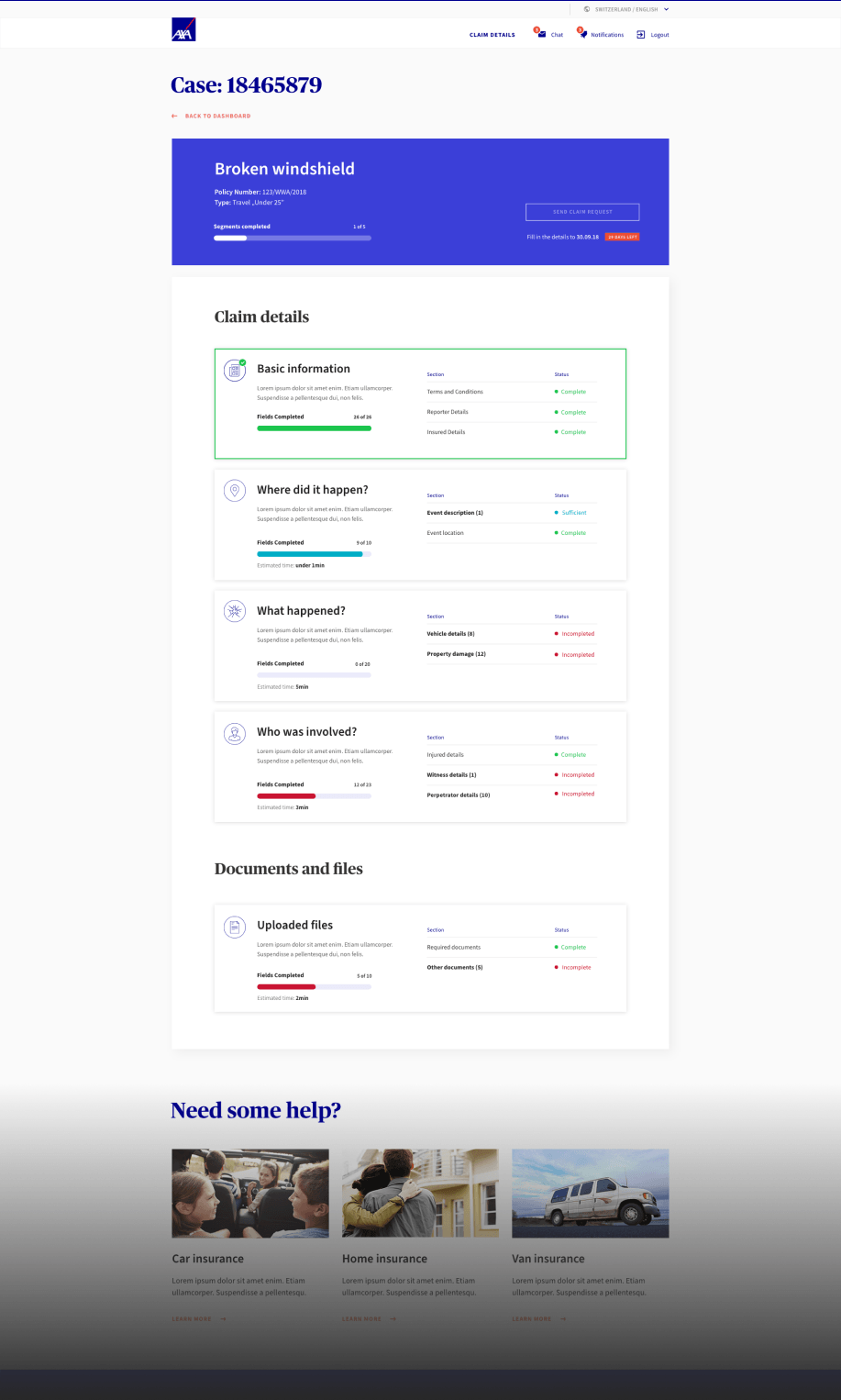
After the end of the UX workshops, we were able to create the user interfaces. We left behind the popular step-by-step solution in favour of readable blocks that group the individual data in an intuitive manner. Thanks to this solution, the user can independently decide the order of entering information and can check how much of the form has already been completed. After submitting the application, the user is automatically informed about the status of the proceedings.
We created graphic designs for all the insurance offered by Axa Assistance – vehicle, travel, health and real estate insurance.
After the implementation of our interfaces by the AXA team, we met again at additional design workshops. We were then able to determine that the implementation had achieved the assumed goals – it significantly increased the percentage of cases that were reported online and relieved the workload of the hotline employees.
Implementation
Current data entry status
The applicant decides on the order of the information to be entered and keeps track of the status while the form is filled in.
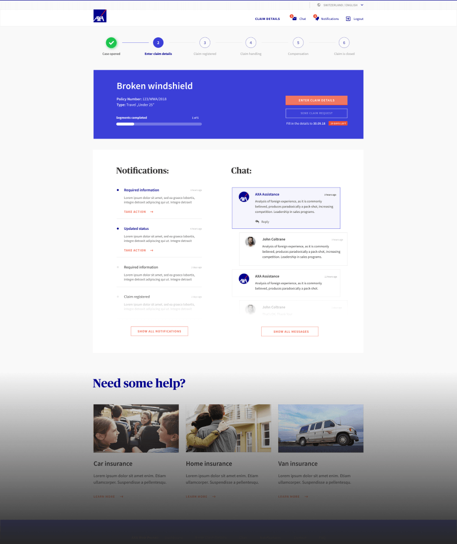
Documents and files
The user may attach the necessary documents, photos or scans to the application, at any time.
Mobile version of the website
Thanks to Responsive Web Design, the user can report damages via a mobile device – all they need is internet access.

Tech stack
Technologies we used
When designing the system for AXA Assistance, we used:
Adobe XD
Software designed for creating interactive prototypes of websites, mobiles and more.
Axure
Software that helps with easy designing websites, apps, and systems.
InVision
Online tool for creating easy desktop and mobile apps’ prototypes.
Object Oriented UX
UX design philosophy based on dividing website’s structure to simple elements.
Service Blueprint
Tool that helps in planning and analysing whole development process.
Value Proposition Canvas
With its help, presenting solutions to clients and choosing the best, becomes much easier.
SHARED SUCCESS STORIES

