In today's digital age, creating interactive and dynamic forms is crucial for many web projects. The right tools allow you to build functional, user-friendly, and visually appealing forms. In this article, we will focus on utilizing Storyblok with the Nuxt framework to create dynamic forms in a simple and efficient way. We'll explore the possibilities this combination offers and provide step-by-step instructions for building forms using this technology.
Where should we start?
To start working, we will need an additional package - Vuelidate, which will provide validation for our dynamic fields. Add the following packages to your project:
npm install @vuelidate/core @vuelidate/validators
# or
yarn add @vuelidate/core @vuelidate/validators
Next, add a file with the Vuelidate plugin (vuelidate.ts) to the plugins folder.import Vuelidate from '@vuelidate/core'
export default defineNuxtPlugin((nuxtApp) => {
nuxtApp.vueApp.use(Vuelidate)
})
Setting up in Storyblok
Validation Components
To achieve dynamic field validation in the form, you need to create corresponding validators as Storyblok components. In this example, we will use:
required: to ensure that the field is not empty,email: to require a valid email address,numeric: to require only numeric input,minLength: to require a minimum number of characters,maxLength: to require a maximum number of characters.
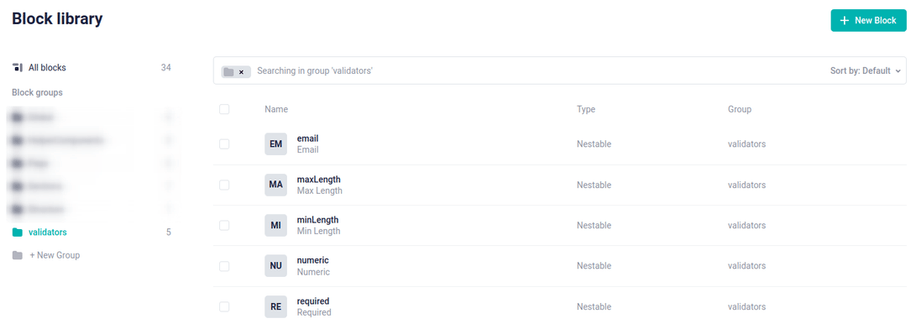
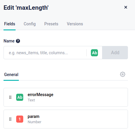
It is important that the component names match the validator names because we will dynamically map them to the validators from the Vuelidate package. The email, numeric, and required components have one editable field - the error message.
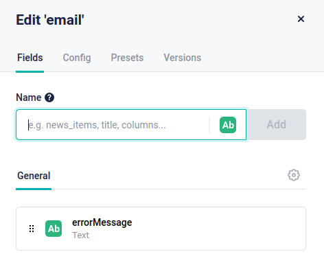
The minLength and maxLength components have an additional editable field that sets the specified length.
The form field component
We create a dynamic form field by adding the inputField component.
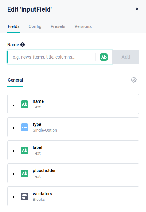
The component consists of the following fields:
name: a text field that allows us to assign a unique identifier to the form field <input name="" />type: a single-choice field with predefined options: text, tel, email. It determines the type of the form field <input type="" />label: a text field used as the label for the form fieldplaceholder: a text field that will be displayed in the form field when it is empty <input placeholder="" />validators: blocks containing a list of previously created validations
Form Component
Now, let's create the dynamicForm component for the form.
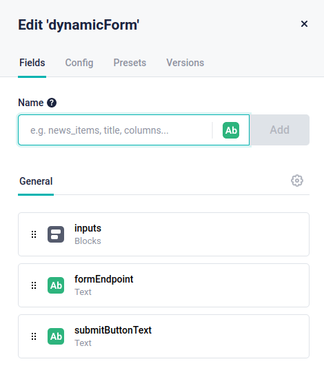
It consists of:
inputs: contains a list of form fields (inputField)formEndpoint: the URL where the form will be submittedsubmitButtonText: the name that will be displayed on the submit button
Vue Components
Now that we have prepared the components and fields on the Storyblok side, we can proceed to create Vue components. We need two components: DynamicForm.vue, which will contain the dynamic form, and InputField.vue, where each individual form field will be located.
DynamicForm.vue
Logic
First, import the validators from the Vuelidate package and the useVuelidate function to activate the validation.import { useVuelidate } from '@vuelidate/core'
import * as validators from '@vuelidate/validators'
In the component, you should also declare props coming from Storyblok.
const DynamicFormProps = defineProps({
blok: {
type: Object,
default: () => ({})
}
})
The initial form data is generated using the form function. It creates an object using the unique name of the form field as the key and an empty string as the value.
const form = reactive(DynamicFormProps.blok.inputs.reduce(
(prevFields, inputField) => ({
...prevFields,
[inputField.name]: ''
}),
{}
))
The generateFieldRules() function is responsible for generating validators for a specific form field. It creates an object consisting of the validator name as the key and its corresponding value. The value is either the default error message provided by the Vuelidate package or a function if the validator requires a parameter. For example, for a validation that defines a minimum text length, you would invoke the minLength() function and pass the parameter specifying the number of characters.
const generateFieldRules = (fieldValidators) => {
return fieldValidators.reduce(
(prevValidators, validator) => ({
...prevValidators,
[validator.component]: validator.param ? validators[validator.component](validator.param) : validators[validator.component]
}),
{}
)
}
The variable fieldRules stores the field names of the form along with the generated validators.
const fieldRules = computed(() => {
return DynamicFormProps.blok.inputs.reduce(
(prevFields, inputField) => ({
...prevFields,
[inputField.name]: generateFieldRules(inputField.validators)
}),
{}
)
})
To activate Vuelidate and make the validation work, you need to invoke the useVualidate method, passing the variables you created earlier. By doing this, you can access the data and options through v$.
const v$ = useVuelidate(fieldRules, form)
The last function is handling form submission - formSubmit(). By checking the value of the $invalid variable, we can determine if any field in the form failed validation. In such case, we invoke the $touch() method, which displays error messages in the respective form fields.
const formSubmit = (e) => {
if (v$.value.$invalid) {
v$.value.$touch()
e.preventDefault()
}
}
In order for the InputFields.vue component to use form validation, the v$ variable needs to be passed to it.
provide('v$', v$)
Combining all the described elements, we get the following logic:
<script setup>
import { useVuelidate } from '@vuelidate/core'
import * as validators from '@vuelidate/validators'
const DynamicFormProps = defineProps({
blok: {
type: Object,
default: () => ({})
}
})
const form = reactive(DynamicFormProps.blok.inputs.reduce(
(prevFields, inputField) => ({
...prevFields,
[inputField.name]: ''
}),
{}
))
const generateFieldRules = (fieldValidators) => {
return fieldValidators.reduce(
(prevValidators, validator) => ({
...prevValidators,
[validator.component]: validator.param ? validators[validator.component](validator.param) : validators[validator.component]
}),
{}
)
}
const fieldRules = computed(() => {
return DynamicFormProps.blok.inputs.reduce(
(prevFields, inputField) => ({
...prevFields,
[inputField.name]: generateFieldRules(inputField.validators)
}),
{}
)
})
const formSubmit = (e) => {
if (v$.value.$invalid) {
v$.value.$touch()
e.preventDefault()
}
}
const v$ = useVuelidate(fieldRules, form)
provide('v$', v$)
</script>
Form Component Template
In this template, we create a form that has:
action- an attribute specifying where to send the form data after submissionformSubmit- invoking the method when attempting to submit the formInputField- a component containing a single-form fieldbutton- a button triggering the form submission
<template>
<form v-if="v$" :id="blok._uid" class="form" method="post" :action="blok.formEndpoint" @submit="formSubmit">
<InputField v-for="inputField in blok.inputs" :key="inputField.name" :inputField="inputField" />
<button type="submit" class="btn">
{{ blok.submitButtonText }}
</button>
</form>
</template>
InputField.vue
Logic
First, import the necessary functions for accepting data.
import { inject } from 'vue'
Then declare the props coming from the DynamicForm.vue component.
defineProps({ inputField: Object })
And finally, create a variable to have access to form validation.const v$ = inject('v$')
InputField.vue component template:
The template of a single-form field consists of:
- Checking if the field has been filled correctly using the variable
v$[inputField.name].$error. If the content is invalid, an additional class is dynamically added. - Binding the field data using the
v-modeldirective between the element and the Vuelidate data model($model). - Handling validation errors. This is done by iterating over the errors. If the field has a specific problem, it is displayed.
<template>
<div
:class="{
'form__group': true,
'form__group--error': v$[inputField.name].$error,
}"
>
<label class="form__label" :for="inputField._uid">{{ inputField.label }}</label>
<input
:id="inputField._uid"
v-model.trim="v$[inputField.name].$model"
:type="inputField.type"
:name="inputField.name"
:placeholder="inputField.placeholder"
class="form__input"
>
<div v-if="v$[inputField.name].$error">
<div v-for="{ component, errorMessage } in inputField.validators" :key="component" class="form__group__warninig">
<div v-if="v$[inputField.name][component].$invalid">
{{ errorMessage }}
</div>
</div>
</div>
</div>
</template>
Summary
Every developer sooner or later faces the challenge of creating dynamic forms. Thanks to them, clients can add and edit fields in forms without the need for a programmer's intervention.
The presented example can be expanded by creating additional types of fields such as radio, checkboxes, or textareas.


